擬似クラスで作る動きのあるデザイン
2016年01月27日
【こちらの記事は、約4分程でお読みいただけます。】
こんにちは、水曜日のブログ担当の工藤です。
擬似クラスを与えて作る動きのあるCSSデザイン例です。
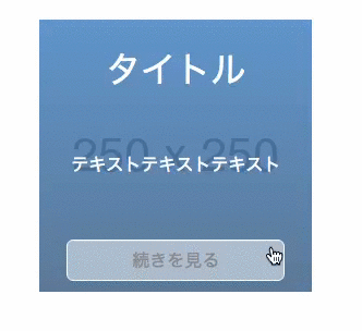
imgをhoverすると下からコンテンツが出てくるデザイン
画像をマウスオーバーすると下からコンテンツが出てくるCSSを作ります。
<div class="content-item">

<div class="content-th"><img src="http://placehold.jp/250x250.png" alt="" /></div>


<div class="content-overlay">

<h2 class="content-title">タイトル</h2>


テキストテキストテキスト

      <a class="content-btn" href="#">続きを見る</a>
    </div>

</div>
.content-item {
  position: relative;
  overflow: hidden;
  width: 250px;
  height: 250px;
}

.content-item:hover .content-overlay {
  bottom: 0;
}

.content-overlay {
  position: absolute;
  bottom: -100%;
  left: 0;
  width: 100%;
  height: 100%;
  transition: all .35s;
  color: #fff;
  background: rgba(0, 116, 217, .5);
  background: linear-gradient(rgba(0, 116, 217, .5) 0%, rgba(0, 65, 122, .5) 100%);
}

.content-title {
  font-size: 2rem;
  position: absolute;
  top: 30px;
  width: 100%;
  text-align: center;
}

.content-text {
  position: absolute;
  top: 50%;
  box-sizing: border-box;
  width: 100%;
  padding: 0 20px;
  text-align: center;
}

.content-btn {
  position: absolute;
  right: 0;
  bottom: 10px;
  left: 0;
  box-sizing: border-box;
  width: 80%;
  margin: auto;
  padding: 10px;
  transition: all .35s;
  text-align: center;
  text-decoration: none;
  color: #fff;
  border: 1px solid #fff;
  border-radius: 6px;
}

.content-btn:hover {
  color: #333;
  background-color: #fff;
}
【解説】
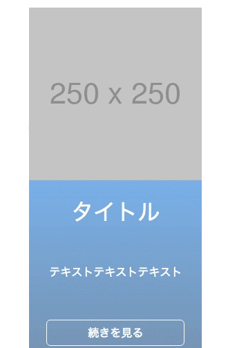
・親のdivに横幅と縦幅を決めて、overflowで隠しています。
overflowを消すと下記のような状態になっています。
.content-item {
  position: relative;
  /* overflow: hidden; */
  width: 250px;
  height: 250px;
}
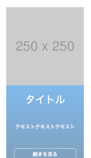
上に乗ってくる要素に、positionで真下に表示させています。
position: absolute;とbottom: 100%;で丁度真下に表示させることが出来ます。
.content-overlay {
  position: absolute;
  bottom: -100%;
  left: 0;
}
content-itemにマウスオーバーしたときの擬似要素:hover時にcontent-overlay:bottom:-100%;を0にするとbottom:0;の位置に移動しまし、content-itemの上に重なります。
.content-item:hover .content-overlay {
  bottom: 0;
}
このままでは、一気に移動してしまうので変化が加わるクラスにアニメーションのCSSを追記します。
.content-overlay {

  transition: all .35s;

}
終わりに
content-overlayのbottomを0にし、透明度(opacity)を0に。
hover時のcontent-overlayの透明度(opacity)に1に変更すると、ふわっと出てくるコンテンツに変更出来ます。
body{
  width: 50%;
  margin: auto;
  padding:30px;

}
.content-item {
  position: relative;
  overflow: hidden;
  width: 250px;
  height: 250px;
}

.content-item:hover .content-overlay {
  //bottom: 0;
  opacity: 1;
}

.content-overlay {
  position: absolute;
  bottom: 0;
  left: 0;
  width: 100%;
  height: 100%;
  transition: all .35s;
  color: #fff;
  background: rgb(0, 116, 217, .5);
  background: linear-gradient(rgba(0, 116, 217, .5) 0%, rgba(0, 65, 122, .5) 100%);
  opacity: 0;
}

.content-title {
  font-size: 2rem;
  position: absolute;
  top: 30px;
  width: 100%;
  text-align: center;
}

.content-text {
  position: absolute;
  top: 50%;
  box-sizing: border-box;
  width: 100%;
  padding: 0 20px;
  text-align: center;
}

.content-btn {
  position: absolute;
  right: 0;
  bottom: 10px;
  left: 0;
  box-sizing: border-box;
  width: 80%;
  margin: auto;
  padding: 10px;
  transition: all .35s;
  text-align: center;
  text-decoration: none;
  color: #fff;
  border: 1px solid #fff;
  border-radius: 6px;
}

.content-btn:hover {
  color: #333;
  background-color: #fff;
}
ボタンにマウスを乗せたら(:hover)ボタンのbackground-colorを変え、クリック(:active)したら、ボタンをプルプル震えさせる。
フォームのfocus時に、フォームのカラーを変える。
等、擬似クラスだけでも出来る事は色々とあります。
簡単に実装出来るので、積極的に実装してバリエーションを増やしていきましょう。